Form
Form is a three dimensional shape such as : a cube, sphere, cone, cylinder or cuboid. Sculpture and 3-D designs are about creating forms. However, in 2-D artworks, tone and perspective can be used to create an illusion of form.

Research: Jonathan Knowles

In this image I like the compactness in the cube of flowers. I would like to do the same but not use anything botanical in my work. Instead I could use child's toys like Lego or other things. I would like to experiment with different shapes to use including the cube however, I could use the pyramid shape and the cuboid. In this image I'm not too keen on the gradient background and think it could look nicer if it were a solid colour. That will be one of the thing I may test out when I complete my edits and improvements. I also like the use of different coloured flowers in the cube and I could easily use different colours with the Lego pieces along with the different sized flowers for the different sized Lego bricks.

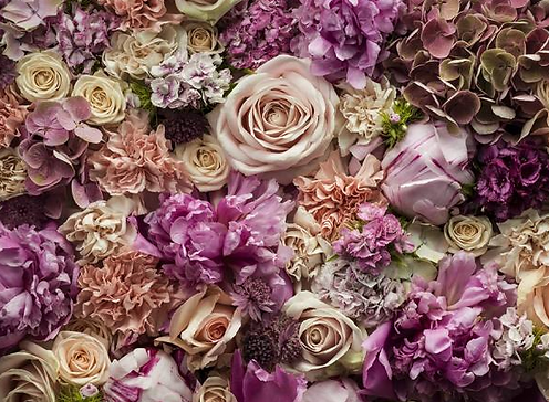
Similarly to the first image I analysed, I was drawn the the compactness of this picture. I also like how inattentive it is because there are so many colours from the same shades where they look so similar but are still very different. I would like to do this almost close up image but instead I may use Lego to fully show the segregation between each colour and the form of the bricks. On the other hand I think I would like to use a corner in my work to give off a better form structure rather then just one flat surface of what objects I may use. I do like the fact that they are similar colours and I would also like to use that in my work.

I like how Knowles has used semi-dead flowers in this image as it separates off from the rest of his work. I could give off this effect without using alive objects by adding a muted tone to my image to create the half-dead look in my work. Again, I like how he has used the compacted style in his work but, I want to experiment with different shapes and sizes to my work so I can be more experimental and learn what i work best with for this project. I don't like how most of the flowers have still got the majority of their colour and I feel that i could try and not use as much colour in my work to see if I still agree with this point later on through out this piece of work that I'll complete.

This is a bit different to the botanical work he usually does. this brought the image to my attention. I like the way the tea has lifted due to the mug falling and breaking on the surface. I don't think I will be able to create a similar effect in my work but i like the split focus in this image. I think it may give off a better effect if it was in black and white. I may want to put some of my work in colour and the rest in black and white to give off a better shape of the object I'm going to use.
Contact Sheet


In this contact sheet I used Legos as the subject for this photo shoot. I wanted to use different shapes and sizes for this and I feel I did that. The images circled in red are the ones I need to improve on and the images circled in green are the ones i like the most out of the photo shoot. Most of my images are either over-exposed or over-exposed. to further improve this photo-shoot I could use i white board or something else to evenly distribute the light in the studio so the shiny plastic material doesn't bounce the light back to the camera like it did in many of the pictures i captured.